The history of hardware is one that has predominantly focused on bridging the gap between the static (unchanging) Human physiology and the user interface. That is to say, innovations from the nascent days of personal computing through today have been concerned with one thing: enabling Humans to interact with data in a seamless fashion – free from the enslavement of intermediary hardware (ie. keyboard, mouse). When we step back, we see this makes great sense; the breaking down of barriers between the Physical World and the Cybervironment.
Much has been made, as should be, of the near-realization of Minority Report-esque technology, wherein data is accessed with a wave of a hand and projected onto the Ether. These imaginings are increasingly becoming reality. Ultimately, we anticipate the full realization of direct-to-brain data delivery. That is, a full circumvention of Human Sensory “Hardware” (ie. ears, eyes) altogether. In the meantime, we will likely witness the continued focus of data consumption innovators to remain squarely on breaking down the space between the physical world and the world of data… with the lion’s share of efforts dedicated to the mechanisms used to deliver and access data.
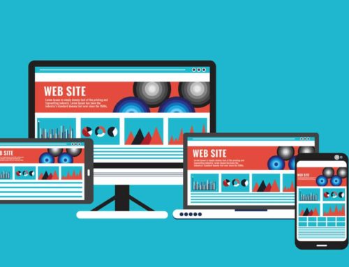
Yet, in comparison to the advancements witnessed in the hardware sphere, Graphical User Interfaces have advanced only slightly in the last decade. The operative phrase being, “in comparison.” Yes, new, more powerful components have permitted new ways of presenting data… and usability has improved significantly, the nature of the data being sifted through, sorted, queried, presented has remained.
To explain this crucial point, let us consider a software such as Quickbooks. Indeed, over the past 10 years, the software has improved. The usability has improved, the number of reports and manner in which the user can slice and dice data has improved. But the output of all of these gains has changed very little. Yes, the graphs look sexier, but they are still graphs. Yes, today a Cashflow Statement can be emailed, baked into a pdf, exported into various formats, shared remotely (unlike in years past) … but the ultimate output, the Cashflow Statement itself (the presentation of information itself) is identical.
Let us imagine a world (some years in the future) where data is transmitted directly into the brain – without use of intermediary hardware or even Human sensory “hardware.” Where the data is delivered seamlessly from the Cybervironment into the surfer’s brain, where it is then processed. In this Future World, There is no barrier to the data whatsoever. Or perhaps it is easier to imagine a Tron-like world, where the user is actually ported directly into the data. Would a Cashflow Statement still look the same? In our opinion, the unfortunate likelihood is it would look the same.
The point of the above is to emphasize two coexisting “realities”… the hyper-advancement of data delivery mechanisms to the relatively stagnant presentation of data itself. If one pays attention to these matters, one is at once impressed by the advancements made in the delivery of data… while concurrently depressed about the absence of innovations relating to the presentation of data.
So, what the hell is a “MetaGUI?”
A MetaGUI is a graphical presentation of data in a metaphorically-themed context.
All of the Great Teachers of antiquity understood the value of lessons in metaphor form. Human Beings have a native propensity to present data metaphorically. Why? Because metaphors are more efficient at conveying large amounts of complex data than any other form of communication.
Take for instance the following opening line from William Gibson’s classic, Neuromancer:
The sky above the port was the color of television, tuned to a dead channel.
Here is another example:
His opinion has evolved over time.
These examples demonstrate the incredible power of metaphors to deliver enormous amounts of data to the Human Brain using very few words to do so.
Each of us has come into contact with MetaGUIs, whether we recognize it or not. Examples of these are few and far between… and, frankly, incredibly rudimentary. Some years ago, Salesforce CRM introduced a report which featured a “fuel gauge” styled graphic conveying lead volume. And, judging from a high-level search today, it looks like others have adopted the gauge for quick-glance reports.
But to get back to the ultimate GUI, the MetaGUI, we need to provide some examples of how the concept might be applied.
Let’s imagine you use Quickbooks for your home or business accounting purposes.
The closest you will get to easily-consumable information is the following flow chart outlining the relationship of various accounts to one another and the top-level activities (actions) you are most likely to want to engage in.

There is value in this sort of relational view, but not much by way of communicating the disposition of your finances. Similarly, running specific reports for specific accounts and transactions has utility. However, these reports: 1) force the brain to consume but a sliver of the overall picture, 2) taken alone likely mean very little.
A MetaGUI on the other hand would convey a ton of information to the Human Brain with just a glance.
Imagine a video game like Civilization – wherein the goal is to build a tribe, then a town, then a keep, then a city, amassing wealth, launching new construction projects, etc. Imagine your city has banks, shops, a home, and is a port city situated on the gulf of a vast ocean.
Now, imagine the following:
1) ships with plus signs on their sails represent incoming cash (and they are at a distance from port in relation to how far off they are from being cashed by you in the future.) So a check you are expecting from your employer tomorrow is very close to port, while your next paycheck is on the horizon. Ships with plus signs moving away from your port city are invoices. With a Net 30, the ship will vanish over the horizon in 15 days and appear on the horizon coming toward your port the next day (making the round trip in 30 days.)
2) ships with minus signs on them are bills. And, in keeping with the temporal, the sooner they are due, the closer they are to port. In addition, larger ships of the line represent larger sums of money.
3) the stack of gold next to your bank is easy.
4) the in progress home being built just outside of town represents the money you have put aside for the real home you desire to build a couple years from now. It’s progress as represented in the MetaGUI is based on the amount of money you need to save to build it. So the closer you get to saving up for it, the closer the home in the MetaGUI is to being completed.
5) likewise for the school that is being built, which represents the amount of money you have saved up for your kid’s tuition.
6) you’ve also a mercantile exchange which represents your investments, which like all other aspects in the MetaGUI can be hovered over for more detail or clicked on for in depth details.
7) the weather represents the performance of your portfolio and the markets of interest to you and how they performed today. If it is cloudy “out,” it was a rough day. If there is a severe thunderstorm it was a really rough day for your portfolio.
With a very quick glance then, the User would be able to discern an incredible amount of information.
1) Cash on hand
2) Payables activity
3) Receivables activity
4) Invoices outbound
5) Payments inbound
6) Savings & Progress toward goals
7) Today’s Market activity
The reason for this is that a MetaGUI as the one described above is built in a manner in which information is conveyed in the most efficient manner possible.
So, what we wish is that someone, somewhere (if it isn’t happening already) put a video game manufacturer together with a financial software provider.
The possibilities are not restricted, of course, to accounting software. We could brainstorm quite easily, for instance, and come up with a MetaGUI for CRM software as well… perhaps involving oil derricks in a large oil field.
You get the point.
If the ultimate end of innovation is efficiency and seamless interaction with data, then MetaGUIs are inevitable.